Trip Me – Travel & Helicopter Ride Booking App
Overview
✈️ Trip Me – Travel & Helicopter Ride Booking App
UX/UI Design Case Study
Designed by Asanda Imesha
🧩 Project Overview
Trip Me is a modern travel booking app concept that aims to simplify how travelers plan, book, and enjoy unique experiences — including helicopter rides, scenic adventures, and custom tours. As a UI/UX designer, my goal was to craft a visually engaging, intuitive, and memorable mobile experience that inspires exploration and trust.
🎯 Problem
Planning travel activities — especially premium experiences like helicopter tours — is often time-consuming and fragmented across websites or agencies. Most platforms feel outdated, lack real-time availability, and don’t inspire users with engaging visuals or trustworthy UX.
🔍 Goals
Make booking helicopter rides and tours as easy as ordering a cab.
Create an immersive, premium experience with vibrant visuals and clear usability.
Design for both spontaneous travelers and organized planners.
Make the app glassy, clean, and modern with delightful micro-interactions.
🧠 User Research & Personas
I conducted lightweight interviews and research to understand traveler habits. Here’s what I discovered:
User TypeNeedsPain PointsSpontaneous TouristsBook quickly, visually browseToo many steps, boring interfacesTravel PlannersCustomize ahead, trust reviewsLack of transparency in pricing
From this, I created two key personas:
Isuru – a 28-year-old photographer from Sri Lanka looking for scenic helicopter views.
Maya – a 35-year-old travel enthusiast booking romantic experiences for her honeymoon.
✏️ Design Process
1. Wireframes & User Flows
I mapped the core journey:
Explore → Select Trip → View Details → Pick Date → Book & Pay
2. Visual Style
I crafted a vibrant, immersive UI using:
A glassy, neumorphic design feel
Soft gradients & shadows
Clean typography and intuitive icons
Emphasis on large hero images for tours
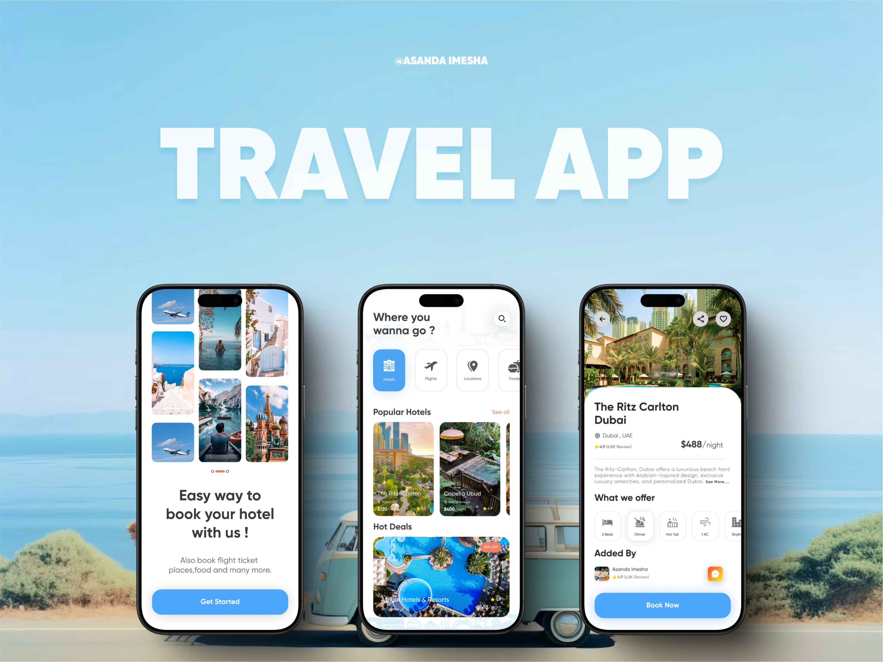
3. UI Highlights
Home screen: Inspires with top tours and a search bar for regions
Trip details: Scrollable gallery, maps, reviews, and clear CTA
Booking flow: One-step calendar, seat selection, and secure checkout
Confirmation & history: Easy to manage past bookings
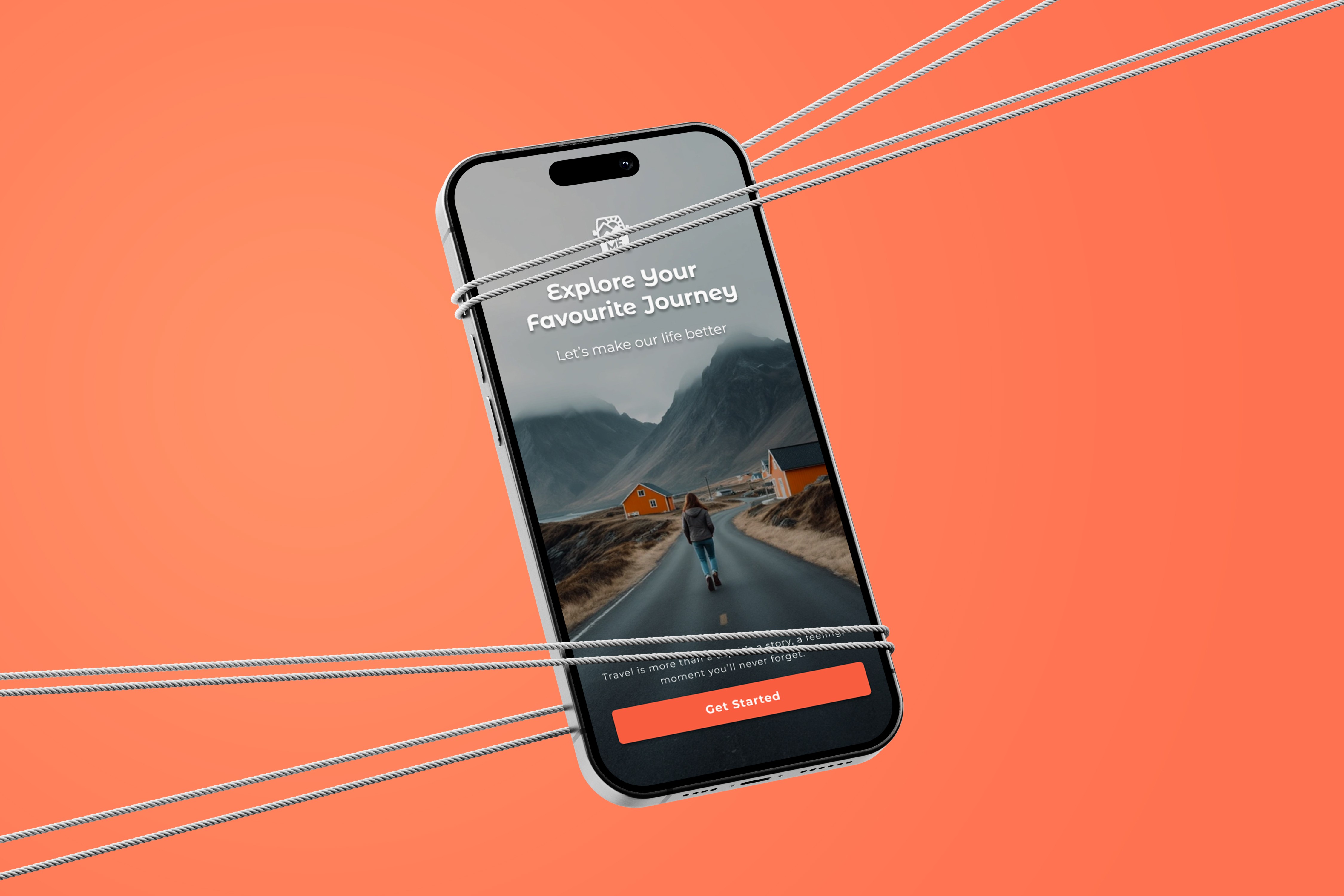
🎨 Final Designs
(Add Figma / prototype link or mockup images here)
Key screens include:
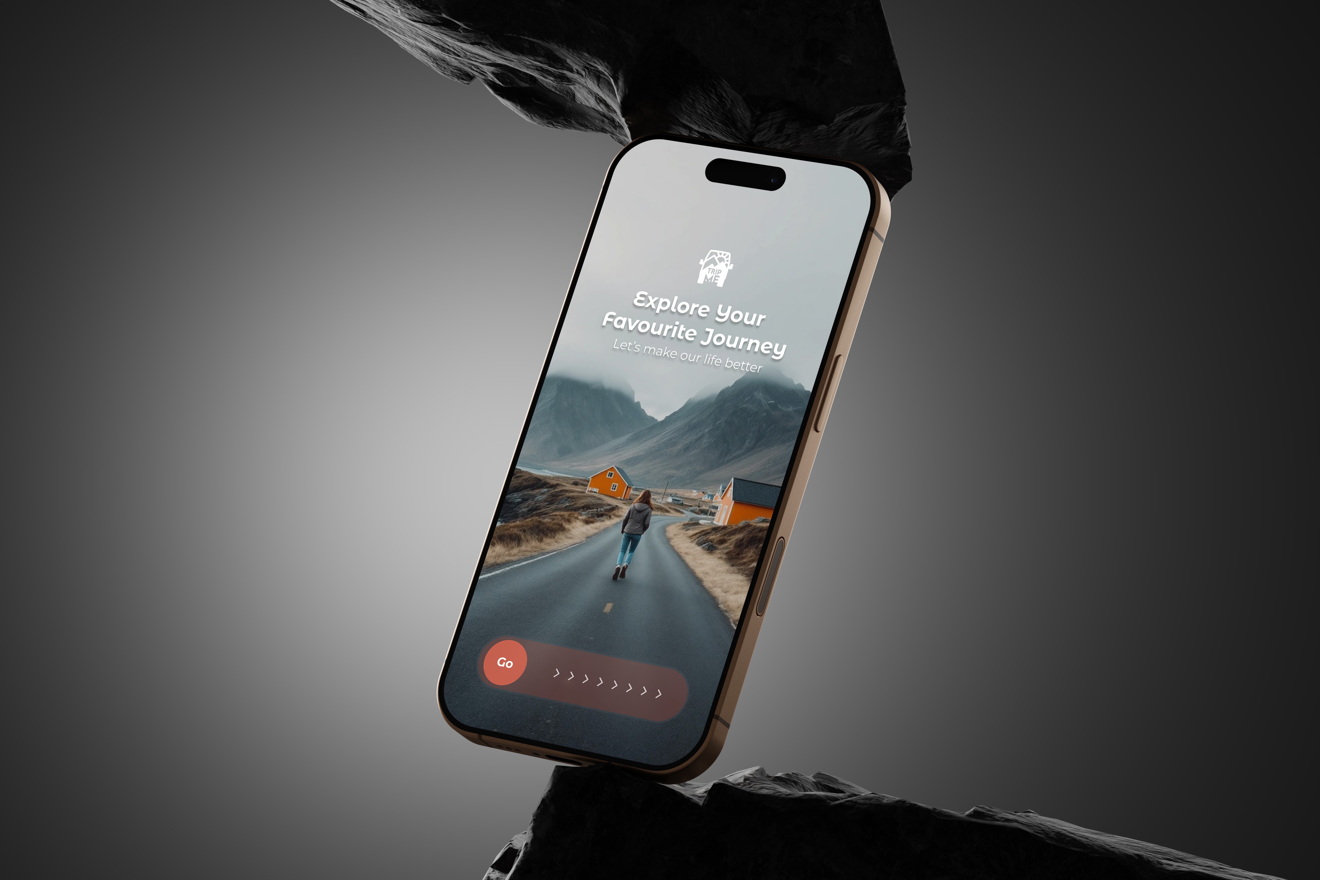
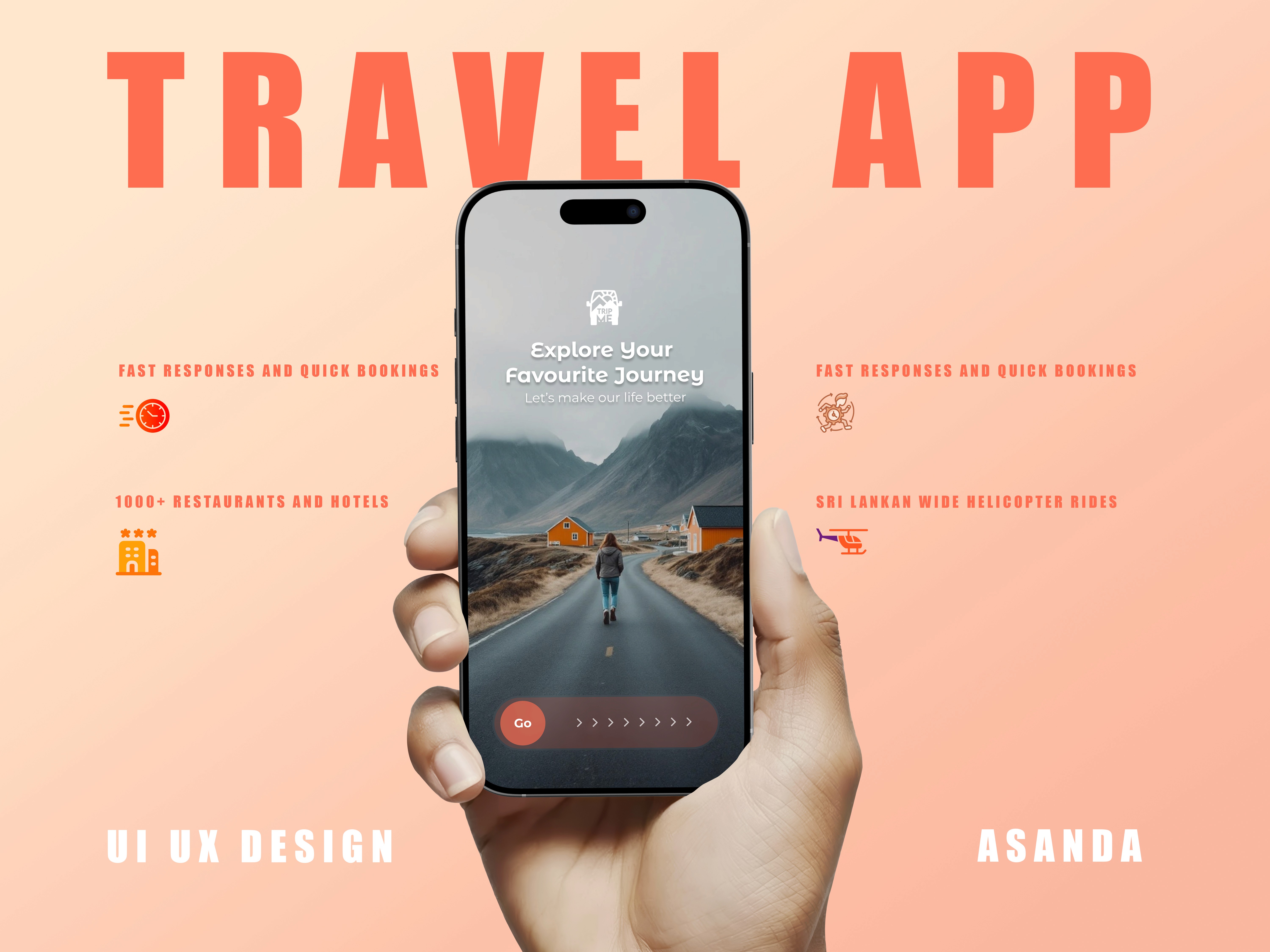
Home Explore Page
Helicopter Ride Details
Interactive Calendar
Booking Summary
Payment & Confirmation
✅ Key Features
🔍 Smart search and filtering
🪂 Curated scenic packages and limited offers
💳 Easy, transparent payment
📅 Availability sync and reminder system
🧭 GPS integration for nearby tours
📈 Results & Takeaways
This was a conceptual design, but feedback from users and peers praised:
The smooth user flow
The luxurious feel of the interface
The clarity in booking steps
What I learned:
Designing for luxury experiences means balancing aesthetic appeal with practical UX. Every tap must feel intentional, and the design should build anticipation — not frustration.
🔗 Prototype
👉 View Prototype on Figma
💬 Reflection
This project let me explore storytelling through visuals and the power of first impressions in tourism UX. I’d love to collaborate with real-world travel startups to bring this concept to life!
Categories
Mobile Ui
Dashboard
Date
Jul 28, 2025
Client
Asanka i Bandara
Trip Me – Travel & Helicopter Ride Booking App
Overview
✈️ Trip Me – Travel & Helicopter Ride Booking App
UX/UI Design Case Study
Designed by Asanda Imesha
🧩 Project Overview
Trip Me is a modern travel booking app concept that aims to simplify how travelers plan, book, and enjoy unique experiences — including helicopter rides, scenic adventures, and custom tours. As a UI/UX designer, my goal was to craft a visually engaging, intuitive, and memorable mobile experience that inspires exploration and trust.
🎯 Problem
Planning travel activities — especially premium experiences like helicopter tours — is often time-consuming and fragmented across websites or agencies. Most platforms feel outdated, lack real-time availability, and don’t inspire users with engaging visuals or trustworthy UX.
🔍 Goals
Make booking helicopter rides and tours as easy as ordering a cab.
Create an immersive, premium experience with vibrant visuals and clear usability.
Design for both spontaneous travelers and organized planners.
Make the app glassy, clean, and modern with delightful micro-interactions.
🧠 User Research & Personas
I conducted lightweight interviews and research to understand traveler habits. Here’s what I discovered:
User TypeNeedsPain PointsSpontaneous TouristsBook quickly, visually browseToo many steps, boring interfacesTravel PlannersCustomize ahead, trust reviewsLack of transparency in pricing
From this, I created two key personas:
Isuru – a 28-year-old photographer from Sri Lanka looking for scenic helicopter views.
Maya – a 35-year-old travel enthusiast booking romantic experiences for her honeymoon.
✏️ Design Process
1. Wireframes & User Flows
I mapped the core journey:
Explore → Select Trip → View Details → Pick Date → Book & Pay
2. Visual Style
I crafted a vibrant, immersive UI using:
A glassy, neumorphic design feel
Soft gradients & shadows
Clean typography and intuitive icons
Emphasis on large hero images for tours
3. UI Highlights
Home screen: Inspires with top tours and a search bar for regions
Trip details: Scrollable gallery, maps, reviews, and clear CTA
Booking flow: One-step calendar, seat selection, and secure checkout
Confirmation & history: Easy to manage past bookings
🎨 Final Designs
(Add Figma / prototype link or mockup images here)
Key screens include:
Home Explore Page
Helicopter Ride Details
Interactive Calendar
Booking Summary
Payment & Confirmation
✅ Key Features
🔍 Smart search and filtering
🪂 Curated scenic packages and limited offers
💳 Easy, transparent payment
📅 Availability sync and reminder system
🧭 GPS integration for nearby tours
📈 Results & Takeaways
This was a conceptual design, but feedback from users and peers praised:
The smooth user flow
The luxurious feel of the interface
The clarity in booking steps
What I learned:
Designing for luxury experiences means balancing aesthetic appeal with practical UX. Every tap must feel intentional, and the design should build anticipation — not frustration.
🔗 Prototype
👉 View Prototype on Figma
💬 Reflection
This project let me explore storytelling through visuals and the power of first impressions in tourism UX. I’d love to collaborate with real-world travel startups to bring this concept to life!
Categories
Mobile Ui
Dashboard
Date
Jul 28, 2025
Client
Asanka i Bandara